Posted on
April 6, 2018
Updated on
September 30, 2024
Read time
 7 mins read
The human attention span is a mere 8 seconds.
That’s less than that of a goldfish — 9 seconds.
So the thing is — you have a few seconds to convince your visitors to stay on your website.
And if you miss it, they will leave the page and move to another website.
Here, proper web design plays a key role to grab the visitors’ attention and converting them into customers.
Pro designers and web design companies already know the secret of increasing conversion rate with the design — and by the end of this article, even you’ll know it. The following are the 10 web design tips that will help you to boost your conversion rate.
1. Make Your Web Design Responsive
Users are 5X times more likely to abandon the task they are trying to complete if the site isn’t optimized for mobile use.
Users no longer visit the websites just on desktops. In fact, the share of mobile traffic is comparatively more. In 2017 mobile traffic dominated the total global web traffic with 52.64%. This shows the importance of responsive websites. And if your website is not responsive, you’ll be losing a huge amount of audience.
Accessing a website designed for a big screen on mobile or other small screens can be an extremely annoying experience. Sluggish pages, zooming in to read the text, awkward buttons, etc. does not provide a pleasing user experience. And, as a result, the user will leave your website in no time.
Designing a responsive website provides a pleasing user experience as the layout adjusts automatically according to the screen of the device. So next time you hire web developers or a Frontend development company, ask them to make your website responsive.
2. Use Faces
Using faces on your website attracts the user’s attention. Humans empathize the faces and if it depicts a type of emotion, consumers are more likely to connect with the website.
Mirroring the feeling of the user with facial images creates an emotional connection between your brand and user. And emotions drive the customer’s decision. This has been widely used by many advertising companies all over the world.
However, you must take care that the images also represent your brand. And try to avoid the stock photos. The following is a snap from Verizon website. The US telecommunication giant has used various faces portraying happy customers using their services.

3. Testimonials and Reviews
If you want to boost your credibility and establish trust with your customers, testimonial and reviews are must-have on your webpage.
Testimonials and reviews work as social proof. According to this principle, we humans use other people’s information and experience to make our decisions.
For instance, if one of your colleagues has appreciated the food of a newly opened restaurant in your neighbourhood, you are more likely to visit there. What if the same guy has scorned about its service? Would you be still excited to visit there?
So, add real testimonials of your services on the webpage. Make sure those are good ones and it will provide a shortcut to judgment for the users.
4. Call to Action Button
Call to action button is a crucial element of your website. You need to make sure that it inviting and clearly visible.
The position and colour of the call to action button play an important role. Ensure the colour is highlighting and it is positioned at the right place considering the visual pattern of the users. This brings us to our next principle of content placement.

(Source-Netflix. Check the attractive colour and placement of the CTA button)
5. Content Placement
The placement of your content is a great tool to influence your customer’s decision. Research has shown that humans follow a visual pattern on the page.
The users read from the top-left side of the page and gradually move to the right. This forms an “F” pattern. Here the top-left portion of the page gets most of the attention. The following heat map shows the reading pattern of the user. The red, orange and yellow area is where the user pays maximum attention.
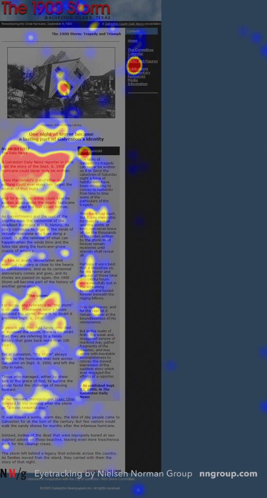
(Source- nngroup.com)
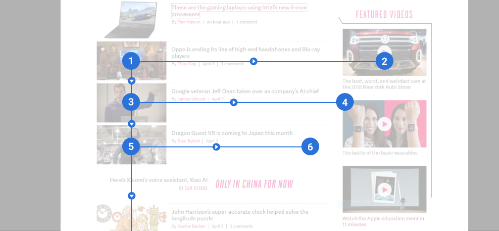
(“F” pattern content placement)
However, the attention of the user gradually diminishes towards the bottom of the page. But if you add an image between the text, the attention of the visitor is renewed once again. This forms a “Z” pattern. The following is Dropbox’s website forming a “Z” pattern for content placement. The CTA button is placed on the left side.
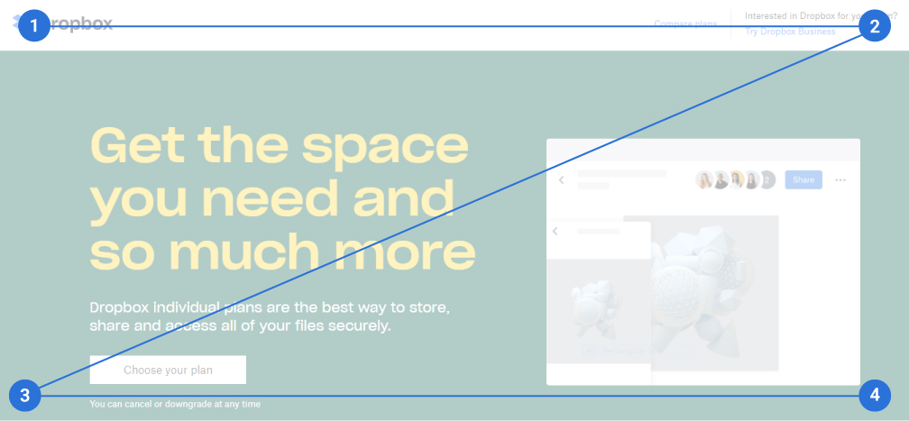
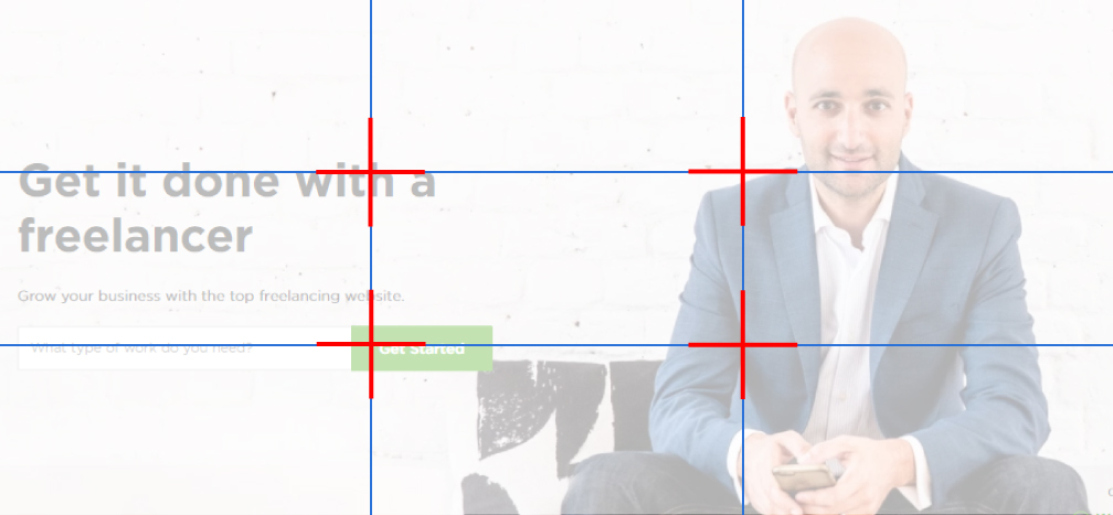
You can also use the rule of thirds to place the main elements of your website. If you have ever used a professional camera or even a camera on your smartphone, you must have seen a grid of nine square boxes. These boxes work as a guide for the photographer to place the elements in the boxes according to their importance and capture the photograph. Use the same to place the elements of your website according to their importance.
6. Unique Selling Point
The unique selling point of your website differentiates you from the huge pond of websites out there. To draw the user’s attention your web design must have a one of a kind design that separates you from the crowd. However, apart from drawing the user’s attention, make sure that your USP also sticks to the user’s mind.
7. Keep it Simple
76% of consumers say the most important factor in a website’s design is “the website makes it easy for me to find what I want.”
One of the most important principles of design is to make information and interaction easier. I have heard many people complain about websites, “Why is it so hard to find a thing on this website.” And you never want to hear it from your visitors. This is one of the things that increases the bounce rate.
You need to make sure that they can easily navigate through the pages and get what they need. Try to step into the shoes of the visitor and understand how you can make it easier for them. Organised navigation pattern, uncluttered content, a neat design, etc.
Just remember — keep it simple.
8. Utilize the White Space/Negative Space
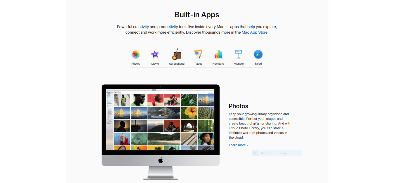
Negative space is the area on the page that is kept vacant. It includes the space between the sidebars and content, header, text and paragraphs. All these negative space helps in making your website look neat, legible and easy on the eyes of the user.
Using a proper combination of negative and positive space can help to provide better user experience and convey your idea efficiently. One of the best examples of proper utilization of white space is Apple’s website. Take a look.
9. Consistency in Colour, Branding, Images and Fonts
One thing that can destroy your web design is inconsistency. It looks unprofessional. A website depicts you as a brand in the digital world. So, any inconsistency in your web design will affect your brand image. Ensure that the elements of your page are consistent. The fonts style, type of images, colour scheme, logos, etc must be of the same style.
10. Choose the Right Colours
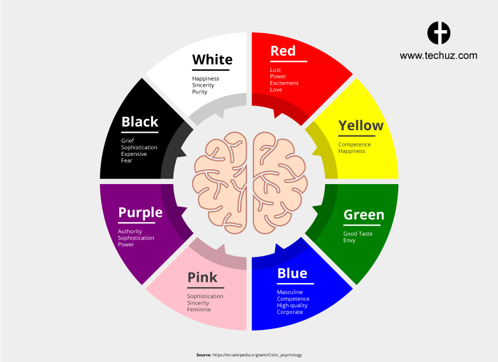
Colours tell a lot about your brand. They can attract the consumer’s attention and influence their buying behaviour. Consumers form an initial judgment of a product within in 90 seconds of interaction and 62%-90% of them are based on the colour.
Different colours have been proven to evoke different emotions. So, using the right colour scheme while designing can represent your brand and mood of your website.
Using contrasting colours can make your essential elements such as the banner headlines, call to action button, testimonials, etc. stand out. Colour contracts work to emphasize an element over others. So, you can use high contrasting colours between the background and the elements you want to draw attention.
Wrap Up
Now you know how your web design can boost your website conversion. Just implement the above principles and tips for your website and you’ll observe a difference.
Hope you are benefited from reading it. We are Techuz, a top web development company in India. We have been providing web development services to our clients for almost half a decade now. If you have any questions or inquiries, feel free to get in touch with us.


