
Posted on
May 7, 2020
Updated on
March 26, 2024
Read time
 12 mins read
There are two kinds of websites out there. First ones — bland, dull, some trying hard to stand out with ostentatious colours, typefaces and images. But they end up confusing, muddled and ugly.
And then there is another breed of websites where everything is in harmony; your eyes smoothly flow from one piece of information to another, every element in proportion, everything in balance, everything in rhythm. These websites — stunning, jaw-dropping, a web design masterpiece.
And it’s not just good looks. They are functional and effortlessly serve the purpose.
So what separates the former ones form the latter — the sloppy and clumsy from aesthetic web UIs with clear information architecture, enhanced usability, interaction and experience?
Well, it’s the basics.
The latter ones get their basics right.
They are built adhering to the primary principles of design. The set of rules accumulated from varied disciplines — mathematics, psychology, behavioural science — that provide the foundation for appealing visuals and a balance of form and function. And in this article, we’re going to understand that. We’ll discuss the following principles of design.
- Contrast – Shows Relative Importance
- Balance – Ensues Balance in Design
- Emphasis – Makes Key Element Stand Out
- Repetition – Brings Consistency
- Variety – Breaks Monotony
- Visual Hierarchy – Arranges Information
- White Space – Creates Breathing Space
- Rhythm – Guides the User’s Eyes
- Proportion – Scales Different Elements
By the end of this article, you’ll understand these nine principles. And not only that, you’ll collect enough information to apply it to your next project and make it stand out.
Sounds like a plan? Let’s dive in.
We answer all these questions and more in this blog:
Key Principles of Designs
1. Contrast
“Can we make this thing more…umm…pop up?”
You know what clients mean when they say that? It’s contrast.
Contrast is the difference in visual elements that makes one object over other more distinguishable — the object in the front over the one in background.
Designers use this design principle to make the important element stand out. It’s just like presenting a diamond on a velvet cloth.
Contrast is a great tool to draw user’s attention, communicate a clear message and establish hierarchies of the elements.
Generally while discussing contrast in design, it’s the colour contrast that comes to our mind. For example, black text on a white background is what we call contrast. But it’s not just the colours, there are a number of ways you can implement contrast in your design such as size, space and fonts. Here take a look.
Colour Contrast
This is the most common way of using contrast — colours from different segments of the colour wheel. However, make sure the contrasting colours you use really makes the relative visual difference, as not all contrasting colours are good at it. Workaround with different colours and you can always use a contrast checker tool.
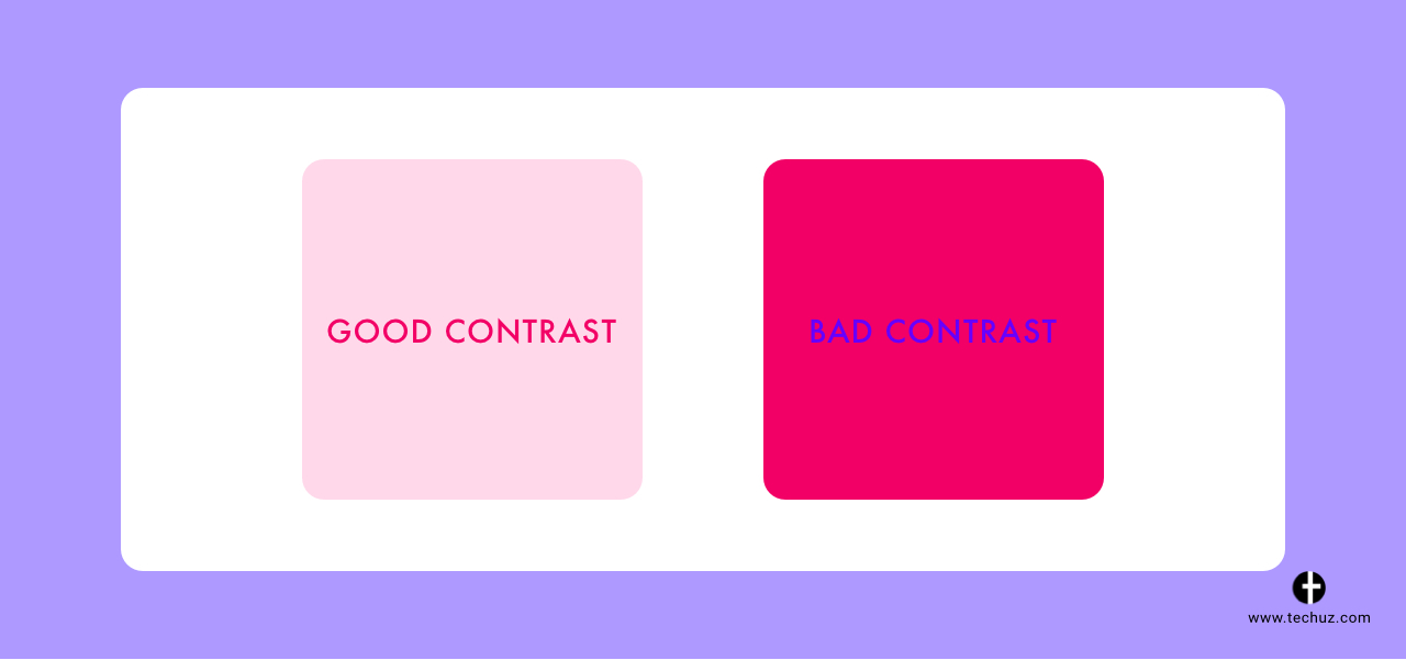
(Good contrast vs bad contrast)
Size Contrast
Bigger elements stand out, they take more space and are discovered by the user first. By varying the size of the elements you can decide which elements will be highlighted. It’s a very effective and easy way to create a dynamic. Use different size for the element on the page to create contrast and drama in the design.
Space Contrast
Using negative space is another smart way to create contrast. Add some negative space around the important element to make it stand out and draw the user’s attention. Google’s homepage is a classic example of space contrast.
Fonts Contrast
Fonts can be used to emphasize certain text. You can draw the user’s attention to the content that has more significance by using different fonts or typefaces. This is an effective way to draw the reader’s attention to important messages on your website. However, avoid using too many different fonts as this dilutes the main message and its uniqueness.
2. Balance
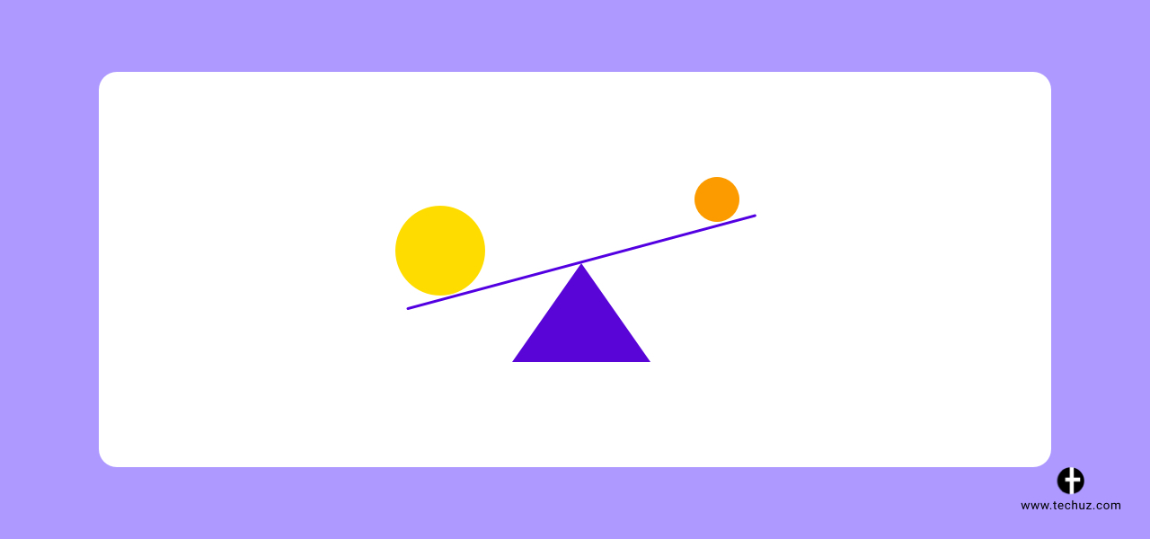
Just like any physical object, the elements on your web page — shapes, patterns, colours, typefaces, images, etc. have weight. And by proper distribution of these elements, you can balance the visual weight to create harmony, cohesion and richer user experience.
There are two ways to do this — symmetrical balance and asymmetric balance.
While generally balance and symmetry are related to each other — there’s a misconception that both are the same. They are different. In fact, symmetric and asymmetric are the tools to achieve balance and equilibrium in the design. Let’s understand these two balances.
Symmetric balance is the equal distribution of weights of an element around a centre or across the axis.
“Equal distribution” is the way to achieve balance here. Humans are bilateral creatures that prefer symmetry. So when our eyes see the elements of equal weights our mind feels complete.
While asymmetry is on the other side of the spectrum.
Asymmetry balance is a composition of elements with unequal weights.
Although there is no symmetry here, there is an equilibrium in design and it breaks the monotony to make things interesting. This also is a great tool to put more emphasis and dominance on certain elements of the screen. When applied in the right way, this design principle can guide the user’s eyes to the focal point you want.
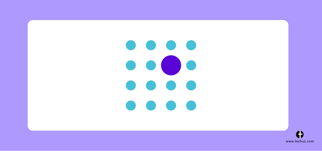
3. Emphasis
Emphasis in design aims to draw the user’s attention to certain information or elements on the page. This could be anything — the product image, a call to action button, a headline of the website or the testimonials. It depends on what you want to accomplish on the web page.
To put it simply, emphasis creates a focal point to grab the user’s attention to certain objects.
Now, to apply emphasis to your design you need to understand the concept of the dominant and subordinate element.
Dominant element is the main message you want to communicate to the user — the main element that the user should draw their attention to. And subordinate elements should guide the user to the dominant element or somewhat capture the attention but not should eclipse the dominant. Once you understand your dominant and subordinate elements you can use colour, shape, size, proximity, similarity, isolation, etc. to create emphasis.
4. Repetition
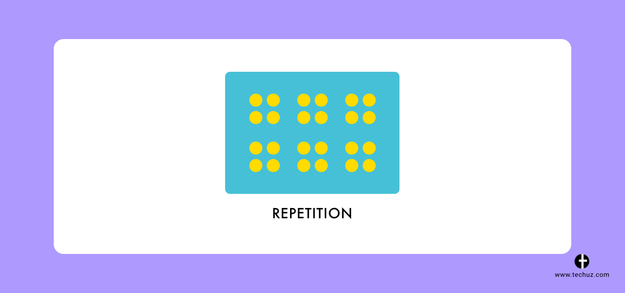
Repetition is simply using the same or similar design elements throughout the pages of the website. It is used to create consistency, reinforce an idea, create cohesiveness in design and overall better user experience.
The reason why this principle works effectively is that we have a tendency to find expected patterns. The more your users encounter the repeated patterns, the more they internalize it and the more comfortable they get using the interface.
So while designing your web UI consider repeating the following elements in your web design:
- Header
- Footer
- Navigation
- Fonts
- Typography
- Colour
- Shapes
- Textures
- Patterns
- Graphics
- Image style and placement
And remember, if you are looking to mix-up the elements to avoid the monotony of repetition, never alter the basic elements such as website navigation, header footer, call to actions — as it may end up confusing the visitor.
5. Variety
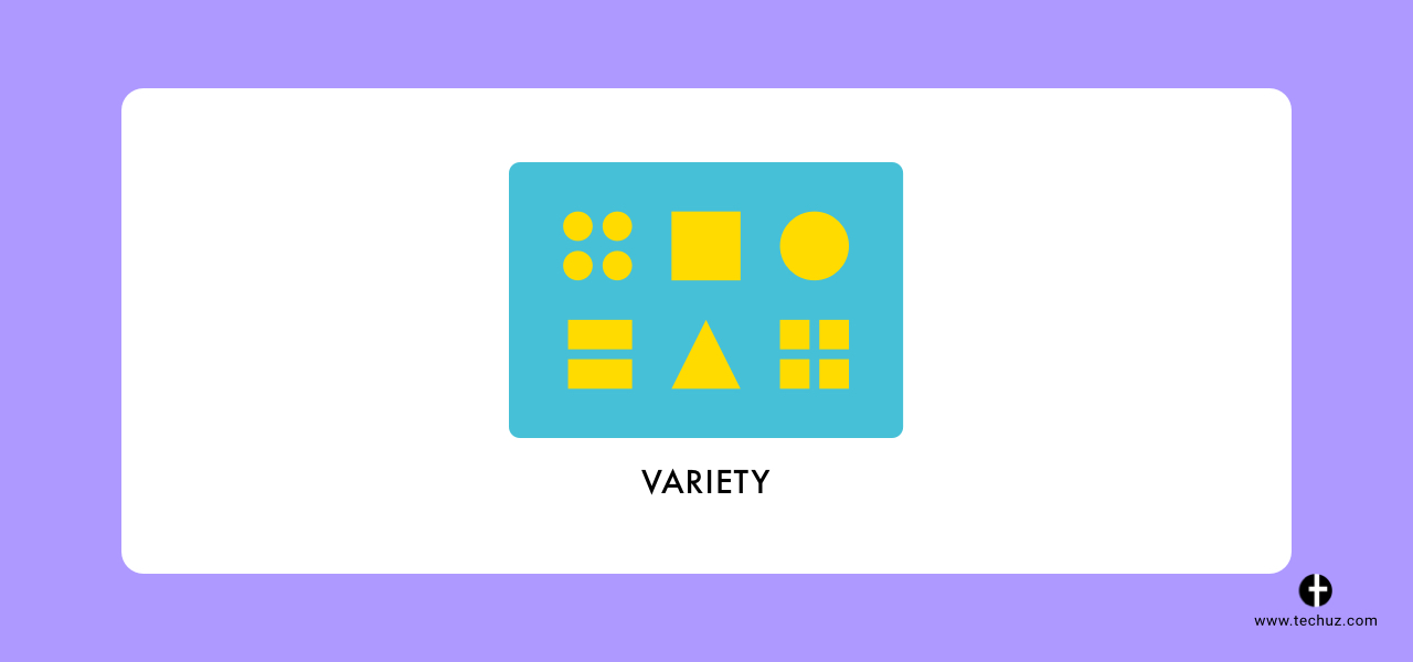
While repetition is one of the principles of design that brings unity, variety, on the other hand, breaks repetition to avoid monotony.
Variety can be used in different ways — through typography, colour, size, images, shapes, etc. It’s essential to understand that the variety created without a goal or to enhance the user experience and aesthetics is pointless. An example of good variety is using different typefaces and weights for headings and text paragraph — however, at the same time, you need to repeat the same variety in different pages and sections across the website.
6. Visual Hierarchy
Hierarchy focuses on how well the content can be processed by the users on the website. You create a flow of content on the page by creating hierarchy in the layout.
Visual hierarchy is often compared to the journalistic way of writing — the inverted pyramid method where you arrange the information as per the importance of the message.
Similarly, when using visual hierarchy in design, you arrange the visual elements in different levels to create a sense of order, prioritization and visual cues — and to distinguish elements of the higher, low or same weight.
These visual cues that help you present the information clearly also allow the users to immediately understand what’s in for them. For example, when a user lands on the page they can immediately recognize with the banner text and image if this is what they were looking for.
The common tools of the trade for creating visual hierarchy are size, fonts, colour and negative space.
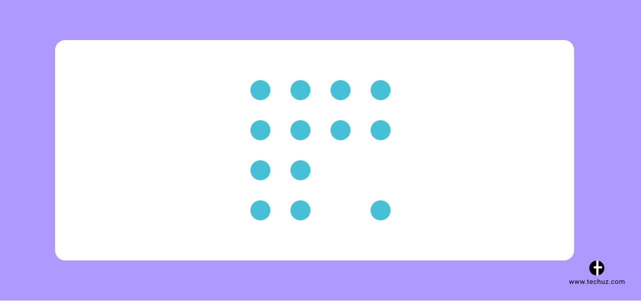
7. White Space
A web page stuffed with elements and objects all over the space can make things difficult to understand and read. It doesn’t give the user’s eye a room to breathe or focus on one element. The worst part — it leaves the users baffled and they may bounce off the page. That’s where white space comes to rescue.
White space — also known as the negative space — is the fundamental building block of good design. To define it simply, it is the empty space between the individual and different design elements. It primarily gives a breathing space between the content which makes the information legible and digestible to the users.
While other principles of the design on the list deal with adding something — this design theory is all about removing the elements. There are two distinct types of white space used in web pages — macro and micro.
Macro White Space
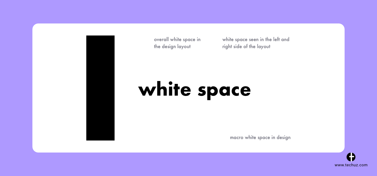
Macro white space is the overall white space in the design layout. This is the white space seen in the left and right side of the layout, between different sections or different design elements. Macro white space is easier to notice and defines the overall bigger picture of the design.
Micro White Space
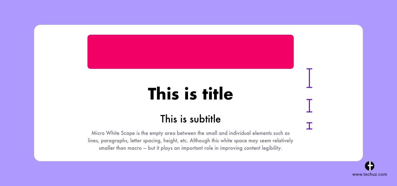
Micro white space is the empty area between the small and individual elements such as lines, paragraphs, letter spacing, height, etc. Although this white space may seem relatively smaller, it plays an important role in improving content legibility.
Often clients may see white space as a waste of the screen space — and would consider adding more information and elements but that would only hurt the elegance of the design and user experience. Here, check the advantages that white space on the page can bring to the design.
Better content legibility
As discussed, micro white space impacts the readability of the content and thus the user spends more time on the page and has a direct impact on the experience.
Highlights key elements
Key elements on the page where you want users to draw attention are highlighted with negative space. It builds a focal point and the user’s attention can be drawn to a specific element or message on the page.
Clean and minimal look
Less is more — that’s what this design principle deals with. Smart utilization of white space helps you achieve a clean, elegant and minimalist web design.
Separates the elements
White space acts as a separator that divides the distinct elements to improve the visual layout. This helps communicate different ideas and information effectively within the page composition.
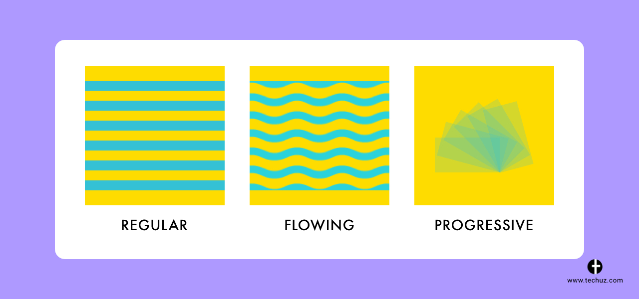
8. Rhythm
Just like music, rhythm can be created in design too. You can create a composition of your website where the user will follow along just like musical rhythm. And this can be achieved by repeating the pattern, layout and elements in the design
Rhythm or movement in design results in setting the mood of the web interface and enhancing the look and feel of the web page. There are five basic types of visual rhythm you can create in design: Regular, random, alternating, progressive and flowing rhythm.
Regular rhythm is simply a repetition of elements at a regular interval and at the same spacing in the design. While random is the opposite of it — there is no predictable pattern. An alternating rhythm is similar to the regular rhythm but just with more complexity. Progressive, on the other hand, uses patterns and scales to create change over time — a gradual progressive change in design or size of the element that creates a rhythm.
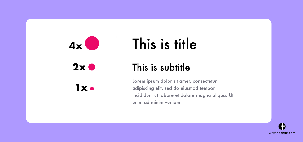
9. Proportion
Proportion has a long history way back to ancient Greece where sculptors used this principle to chisel masterpiece out of marbles. Even Egyptian artists used canon of proportions to determine the perfect proportion of elements in their art.
Today, proportion is one of the most important principles of designs defining the scale of different design elements for balanced and harmonious web design. And this harmony and balance are what makes the design visually pleasing. Apart from that, it is a great tool to achieve consistency, rhythm, make certain elements stand out, drive attention, implement visual hierarchy and even evoke emotions.
Wrapping Up
Understanding and implementing these principles of design can notably improve your designs. Practice them, try which works for your project and understand how incorporating them in the design can help enhance the visuals and user experience.
Treat these principles as a set of tools under your belt. The techniques to influence the user’s perspective, grab their attention, communicate a clear message or structure the information — just like grabbing the users by the hand and leading them to the places you want them to go.
Looking for timeline and cost estimates for your app?
Contact us