

Posted on
September 16, 2021
Updated on
March 26, 2024
Read time
 5 mins read
A pleasant and relevant user experience is the foundation for successful designs. However, getting it right is easier said than done. You’ve to invest significant time and effort in the UX design process: researching, interviewing, analysing, finding problems, and designing solutions that address them. That’s where UX design patterns come in providing proven solutions for usability issues. In this article, we’ll explain what are UX design patterns, why using them in your designs matters, some common examples and how to apply them to your designs.
We answer all these questions and more in this blog:
What are UX Design Patterns?
UX design patterns are the approaches applied to address common design problems. These patterns have successfully worked in solving usability problems and creating a pleasing user experience. An example of such a pattern is the pull-to-refresh gesture on touch devices; you just pull down anywhere on the screen, and the content on the screen gets refreshed.
This pattern improves usability through familiarity and ease. The gesture is a standard way to refresh content, so it meets the user’s expectations. It is also an easier way of retrieving new content without the need to find and touch the refresh button. Thus, using such UX design patterns in your design makes the tasks easier and the interaction pleasant.

Why UX Design Patterns are Important?
UX design patterns are important from two perspectives. The first one is the very essence of UX design — to create a better user experience. And the second one is from the designer’s perspective — to reduce efforts through reusability. Let’s understand both perspectives.
Users have already established mental models on how to use an app or website based on prior experience. In fact, they are so habituated to certain patterns that their actions are instinctive. And so when they use a new app they expect a similar interface. If you built your app without considering this, the users are more likely to get frustrated and even end up having a bad experience. Technically speaking, UX patterns reduce cognitive strain by creating familiar interfaces that users can interact with intuitively.
While for designers UX designs patterns work as a tried and tested approach to addressing a design problem. This significantly reduces time and effort on a design. Imagine a designer constantly coming up with new ideas and reinventing the designs for every project. That would be a lot to do. And that would be never-ending. So with design patterns, designers don’t have to invent something new every time and instead just pull out these patterns from their toolbox.
However, using the UX patterns doesn’t mean they are cookie cutters to designing every interface. You still have to think and research to come up with the best designs. These patterns just work as structural and behavioural features that you can adopt and customize where needed. We’ll look into how to use UX design patterns to improve your design in a while.
What are Common UX Design Patterns?
There are numerous design patterns that can be categorized based on purpose and use cases. The most commonly used ones fall into these 4 groups: Input and output, navigation, content and information structuring and social sharing. Let’s take a look at them in more detail.
1. Input and output
Users need to enter the information in several places on the interface. It can be for signing up, choosing a date for booking, entering contact and other personal details, credit card numbers, etc. The input and output patterns are aimed at making the data input easy and at the same time providing them feedback about the entered information. Examples of input and output patterns are as follows:
- Password strength meter: This helps users to create a strong password to prevent malicious password cracking.
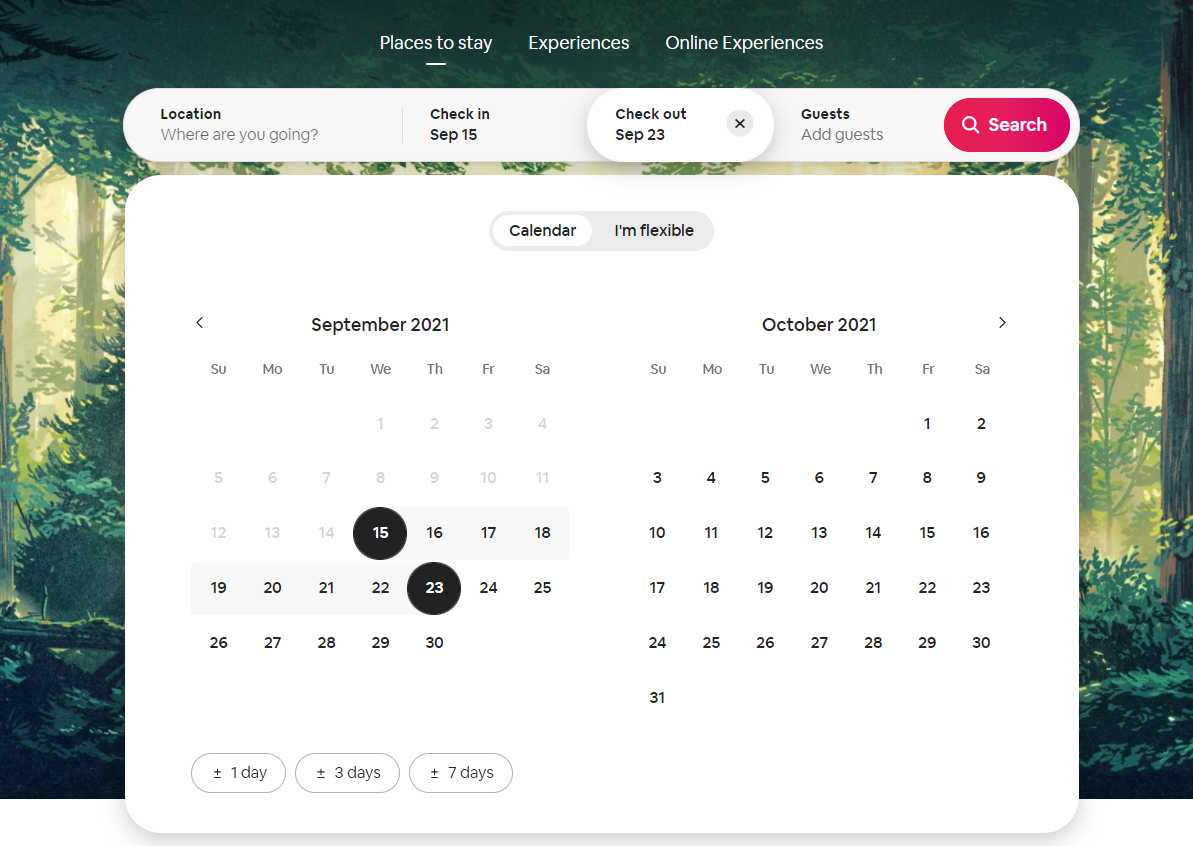
- Calendar picker: The calendar picker allows users to choose the date to enter, sort or track data. The calendar graphics within the interface make it easy to choose the date or date range and make quick decisions.
- Good defaults: Good defaults prefills certain user data that are likely to match. It is useful when the system can make the appropriate guesses of the input fields. For example, input fields country or location.
- Captcha: Captcha helps reduce spamming by differentiating human users from automated bots.
- Preview information and updates: Previewing information helps users double-check that the inputs are correct and accurate as they need. It helps them safely explore the interface resulting in better interaction and experience.
- Wizard: Wizard breaks down one big task into small sub-tasks and helps users complete it step by step and one at a time. It is highly useful when the user has to input complex and large amounts of data and follow specific steps in sequence.
2. Navigation
To perform tasks and get the information, the user has to locate features and browse through the product. Navigation patterns are aimed at making this easy by reducing friction and increasing learnability. They help users understand where they are now and how to reach to the point they want. Common examples of navigational UX patterns include:
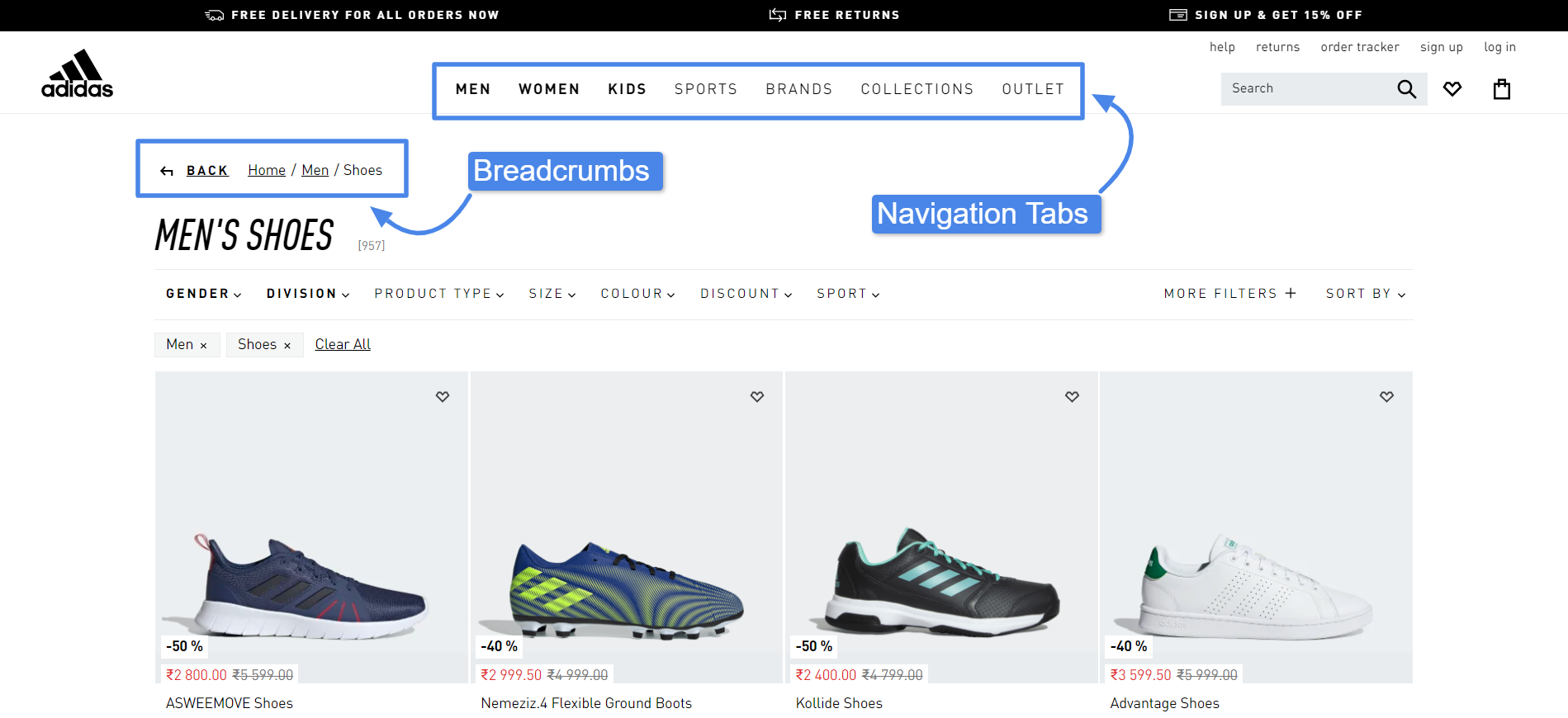
- Navigation and module tabs: Tabs divide a large amount of data into separated sections, making them more accessible and easy to navigate. It is the most common navigation pattern that you’ll find across all digital products.
- Pull-to-refresh gesture: Pull-to-refresh gesture on certain devices help users load new content with a simple pull-down gesture. It’s the standard pattern to refresh the content in social media, chat, email news and content apps.
- Breadcrumbs: Breadcrumbs works as a visual aid helping users know their location in the site’s hierarchy. This makes it easier for them to go back and forth and thus simplifies the navigation.
- Progressive disclosure: To help users focus and easily navigate, you need to minimize the clutter and cognitive load. Progressive disclosure helps you do that by presenting only the required data and displaying other details upon request.
3. Content and information structure
Content and information structure is similar to the navigation patterns. A clear content structure makes it easy for users to find and access the information. These UX patterns help you arrange the information in a logical order that improves readability and accessibility. Examples of content UX patterns include:
- Carousel: Carousals enable you to display multiple pieces of content in the same place on your page. This is highly useful when you have to showcase a set of items or explain a process.
- Tagging: Tagging helps to label, organize and categorize items using keywords. You can use it in your product when you want to associate a piece of content with multiple topics or when the content falls into multiple categories.
- Thumbnail: Thumbnails provide an overview and preview of different kinds of content: images, videos or text on the page. You can use this pattern when a large number of images and videos are presented to the users, they have to browse the collection and decide which one to choose.
- FAQs: Frequently asked questions or FAQs section is a place where users get answers to common questions. This provides them with a quick solution for their problems or a better understanding of your product/services which results in a good experience.
- Dashboard: Dashboard gives an overview of important data, functions and control in an easily understandable way. It helps users monitor critical information at a glance so that they can make a quick decision. A good dashboard has multiple information but doesn’t confuse the users and every element is presented as per the hierarchy of their importance.
- Product page: Product pages in an e-commerce app/website shows details of the product to help users make a purchase decision. A good product page must have the necessary elements like high-quality product images and videos, and social proof like reviews, ratings and badges that reduces friction and induce trusts such as easy return and secure payments.
4. Social

Social features and components have become an essential part of products for they bring higher engagement and growth. Most successful games and apps in the market have features that help users communicate, share, compete and collaborate with other people online. Here are some of the common social UX patterns:
- Share: Users want to share particular content or interaction on their social media. Features like quick share buttons and auto-share make it easy for them to post updates.
- Reactions: Reactions help users express sentiments about something in a simple way. It is useful to understand user’s likings and preferences.
- Chat: Personal and group chat helps users to interact and be a part of the community.
- Invites: Invites allow users to share their enjoyable experiences with others and bring them to your product. It also provides a way to connect with their friends and have a better experience on the platform.
- Activity feeds: Activity feeds give users an overview of what’s happening and expose them to the content of their interest. This helps them explore new things resulting in higher engagement.
- Collectable achievements: Achievements display the user’s status and reputation in the community. Adding collectable achievements such as badges, awards, points, acknowledgement etc. throughout the user journey increases engagement.
What are dark patterns in UX?
Dark patterns in UX take advantage of users’ biases and intuitive behaviours and lead them to do something that they didn’t intend to do. A popular example of this is ‘forced continuity’, where a user is provided with a free trial of the product and is automatically moved to a paid plan as soon as the trial ends.
Consider dark patterns as the evil twin of UX patterns. These patterns are not focused on improving the experience but rather benefitting the product/website owner by increasing sales, influencing users’ behaviour, or getting their personal information.
While dark patterns are used widely in the industry, and even by huge brands, whether they are unethical or just clever is still questionable. For example, is the limited stock notification on the product page added just to create FOMO or help genuinely interested buyers make a quick decision before the stock is out?
How To Apply UX Design Patterns to Your Design?
1. Identify the problem
The first and foremost thing is to identify the issue you’re trying to solve. Patterns are solutions to problems, and if there’s no problem, applying patterns doesn’t make any sense. There are a couple of research methods you can utilize to discover the problem.
- Conduct surveys. Surveys can be used as a feedback tool to understand users’ experiences. You may want to ask users questions such as what they liked and disliked the most, how easy was the product/website to use and what features users think should be added.
- Perform usability testing. Usability testing helps you understand how the users interact with the interface. You can perform testing with your existing product, prototypes or even with your competitor’s product. The collected data will help with finding the friction and crucial insights to improve your product.
- Use analytics. Analytics can help you get vital insights about your existing product — what’s working well and what needs to improve. Consider the important metrics such as sign-up rate, bounce rate, cart abandonment rate, etc. to detect the problems for optimizing the design.
2. Analyze the available solutions
Once you have detected the issue with your design, it’s time to look at different approaches to solve it. Search and analyze similar products in the market: How the successful ones have solved the problem? What patterns have they used? Which ones are more liked by users?
Chances are that you may come across more than one pattern as the solution. For example, to display content on your app layout options like cards layout, carousal, split screen, etc. Make a list of all solutions suitable for your design.
3. Apply the patterns and test
Once you have the list of patterns, select the ones that most appropriately address your problem. If more than one patterns are suitable, then you may want to try A/B testing. Essentially, testing will help you understand which pattern works best for you. Perform usability tests and collect analytics data of the new patterns and optimize your designs.
Where To Find UX Design Patterns?
The best way to find the UX patterns is to observe and analyze the popular and successful products. However, there are also some amazing libraries that curate these patterns. Some of these useful libraries are as follows:
- UI Patterns: A comprehensive archive of patterns for almost all design problems — forms, content, menu, shopping, persuasive patterns and more.
- UI Scraps: UI scraps is a blog with a collection of all kinds of good and bad UX design patterns.
- Inspired UI: Pattern library focused on mobile design with patterns for more than 30 categories such as splash screens, sidebars, maps, dashboard, activities feeds and more.
- GoodUI: Huge library of UI patterns for landing pages, content, product, listings, checkout, pricing, cart, signup and more based on experimentation and testing.
Looking for timeline and cost estimates for your app?
Contact us